【Flutter 专题】62 图解基本 Button 按钮小结 (二)
小菜继续尝试 Flutter 的基本按钮;今天小菜学习 MaterialButton 系列相关 Button;该系列以 MaterialButton 为父类,衍生出 RaisedButton 凸起按钮,FlatButton 扁平按钮和 OutlineButton 边框按钮;可根据不同场景灵活运用;
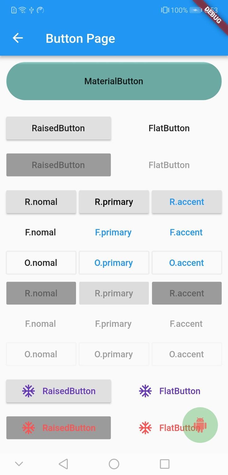
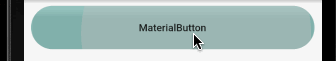
MaterialButton
源码分析
分析源码可知,MaterialButton 作为其他 Button 父类,各属性比较清晰明了,有 hight 属性可设置 Button 高度,其子类 Button 只可通过 padding 或其他方式调整高度;
案例尝试
小菜测试发现 hight 可以设置 MaterialButton 高度,但 shape 按钮形状却不适用;其父类 RawMaterialButton 却正常;小菜尝试网上大神的处理方式是外层依赖 Material 并需要 clip 裁切成 shape 样式;有待进一步学习;
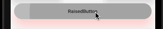
RaisedButton / FlatButton
源码分析
分析源码可知,RaisedButton 与 FlatButton 基本完全相同,只是 RaisedButton 多了一些阴影高度的特有属性,小菜准备同时对两类 Button 进行尝试,比较两者的不同;
案例尝试
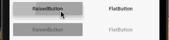
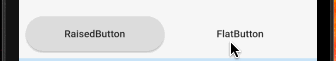
小菜首先尝试最基本的 RaisedButton / FlatButton 可点击和不可点击样式;
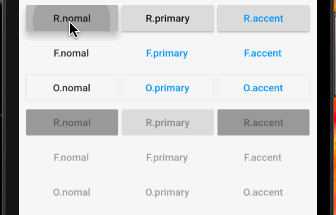
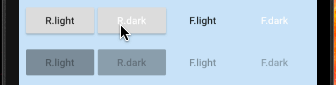
ButtonTextTheme 为默认子元素主题,可以设置基本的三种主题样式:nomal 对应 [ThemeData.brightness];primary 对应 [ThemeData.primaryColor];accent 对应 [ThemeData.accentColor];展示效果比较明显;
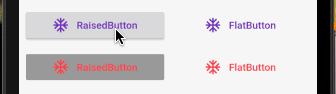
textColor 为子 Widget 中元素颜色,不仅为文字颜色;disabledTextColor 为不可点击时子 Widget 元素颜色;splashColor 为点击时水波纹颜色;
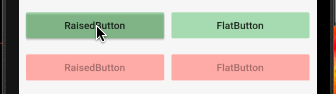
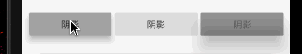
color 为 Button 背景色;highlightColor 为点击时高亮背景色;disabledColor 为不可点击时背景色;
shape 为 Button 形状;因按钮没有 Material 中 hight 属性,需要采用 padding 或外层依赖其他 Widget 调整按钮大小;
colorBrightness 代表颜色对比度,一般分为 light / dark 两种;一般时深色的背景需要浅色的文字对比,浅色的背景需要深色的文字对比;
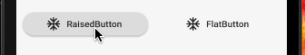
RaisedButton / FlatButton 均提供了 .icon 带图标的简单方式,icon / label 两个属性是必须属性;注意,.icon 方式中 RaisedButton 没有 padding 属性;
elevation 为 RaisedButton 所特有的阴影高度;highlightElevation 为高亮时阴影高度;disabledColor 为不可点击时阴影高度;
OutlineButton
源码分析
分析源码可知,OutlineButton 与其他两种按钮略有不同,强调边框的样式属性且无长按的 tooltip 属性;
案例尝试
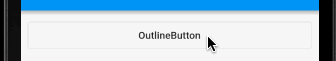
小菜首先尝试一个最基本的 OutlineButton;长按无提醒;
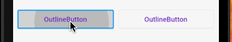
小菜尝试与其他按钮相同的几类按钮属性,使用方式相同;
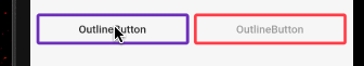
以下为 OutlineButton 特有属性:borderSide 代表边框样式;disabledBorderColor 代表不可点击时边框颜色;highlightedBorderColor 代表高亮时边框颜色;其中 borderSide 可以设置边框颜色宽度及样式(solid / none);
OutlineButton 还提供了 .icon 带图标的简单方式,icon / label 两个属性是必须属性;
扩展
1. textColor 的作用?
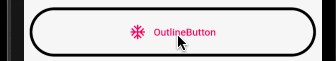
小菜原来以为按钮的子元素是 Widget,可自由设置各类效果,单独的 textColor 是否会略显多余;可实际并非如此,子元素设置颜色等之后 textColor 不生效;但 textColor 与主题相关;小菜以 OutlineButton 为例,一目了然;
2. 阴影如何改颜色?
使用 RaisedButton 时会自带阴影效果,阴影的高度和高亮时的阴影高度均可自由设置;但是阴影的颜色应该如何处理呢,官方暂未提供阴影效果属性;小菜尝试了网上大神的方式,RaisedButton 外层依赖带模糊阴影效果的 Container;小菜借鉴并稍微调整一下,解决方案并非最佳,仅作尝试;
初始时定义一个默认的高度 height 作为阴影高度,监听按钮的 onHighlightChanged 方法更改 height 高度作为高亮时阴影高度;
建议:a. 使用高亮颜色时 highlightElevation 建议设置为 0.0;b. 若按钮有样式设置,依赖的 Container 也要设置相同的 shape 样式;
小菜对 Button 的基本学习暂且到此,还有一些遗留问题有待研究,如有错误请多多指导!
来源: 阿策小和尚
版权声明: 本文为 InfoQ 作者【阿策小和尚】的原创文章。
原文链接:【http://xie.infoq.cn/article/632acd07278c65b1caf568516】。文章转载请联系作者。
还未添加个人签名 2021.05.13 加入
Android / Flutter 小菜鸟~


评论