在 Web 开发中,CSS(层叠样式表)用于设置网站样式的设置。为了控制网页上元素的布局,使用 CSS 的 position 属性。
因此,在今天这篇文章中,我们将了解 CSS 位置及其类型。
CSS 位置属性用于控制网页上元素的位置。它定义了元素相对于其包含元素或视口的定位方式。
以下是位置属性的可能值:
1)Static
这是所有 HTML 元素定位的默认值。在此定位中,元素按照文档的正常流程定位,这意味着它们按照 HTML 结构一个接一个地定位。此模式下元素的位置由其边距和填充决定。
将 top、right、bottom 或 left 属性应用于静态定位的元素将不会产生任何效果。z-index 也不适用于静态元素。
语法:
举个例子:
<!DOCTYPE html><html lang="en"> <head> <meta charset="UTF-8" /> <meta http-equiv="X-UA-Compatible" content="IE=edge" /> <meta name="viewport" content="width=device-width, initial-scale=1.0" /> <link rel="stylesheet" href="style.css" /> <title>CSS position property</title> </head> <body> <div class="box box1">Box1</div> <div class="box box2">Box2</div> <div class="box box3">Box3</div> </body></html>
复制代码
CSS:
.box { height: 100px; width: 100px; border-radius: 10px; margin: 10px; text-align: center; color: white; padding: 10px;}.box1 { background-color: red;}.box2 { background-color: blue; position: static;}.box3 { background-color: green;}
复制代码
输出:
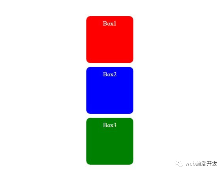
在上面的例子中,我们有 3 个盒子,它们都具有相同的高度和宽度。position: static;属性仅应用于第二个框。
但是,第二个框的布局与其他两个框没有区别,因为 static 是所有 HTML 元素的默认值。
2) relative
使用 position: relative 元素遵循其正常的文档流,但可以从其原始位置移动。这可以使用 top、right、bottom 和 left 属性来实现。
使用此属性,周围的元素不会受到影响,但元素原本处于静态位置的位置将会有空间。
语法:
举个例子:
<!DOCTYPE html><html lang="en"> <head> <meta charset="UTF-8" /> <meta http-equiv="X-UA-Compatible" content="IE=edge" /> <meta name="viewport" content="width=device-width, initial-scale=1.0" /> <link rel="stylesheet" href="style.css" /> <title>CSS position property</title> </head> <body> <div class="box box1">Box1</div> <div class="box box2">Box2</div> <div class="box box3">Box3</div> </body></html>
复制代码
CSS:
.box { height: 100px; width: 100px; border-radius: 10px; margin: 10px; text-align: center; color: white; padding: 10px;}.box1 { background-color: red;}.box2 { background-color: blue; position: relative; top: 20px; left: 50px;}.box3 { background-color: green;}
复制代码
输出:
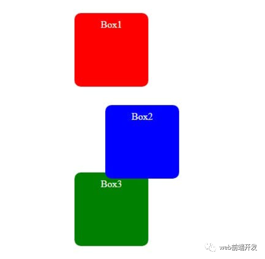
在上面的示例中,第二个框向下移动 20 像素(使用 top 属性),向右移动 50 像素(使用 left 属性)。移动的框不会影响周围元素(框 1 和框 3)的位置。
3)absolute
使用 position:absolute 的元素不遵循文档的正常流程。该元素相对于其最近定位的祖先(具有相对、绝对、固定或粘性定位的元素)进行定位。
语法:
举个例子:
<!DOCTYPE html><html lang="en"> <head> <meta charset="UTF-8" /> <meta http-equiv="X-UA-Compatible" content="IE=edge" /> <meta name="viewport" content="width=device-width, initial-scale=1.0" /> <link rel="stylesheet" href="style.css" /> <title>CSS position property</title> </head> <body> <div class="box box1">Box1</div> <div class="container"> <div class="box box2">Box2</div> </div> <div class="box box3">Box3</div> </body></html>
复制代码
CSS:
.box { height: 100px; width: 100px; border-radius: 10px; margin: 10px; text-align: center; color: white; padding: 10px;}.container { border: 3px solid black; height: 200px; width: 200px; position: relative;}.box1 { background-color: red;}.box2 { background-color: blue; position: absolute; top: 30px; left: 50px;}.box3 { background-color: green;}
复制代码
输出:
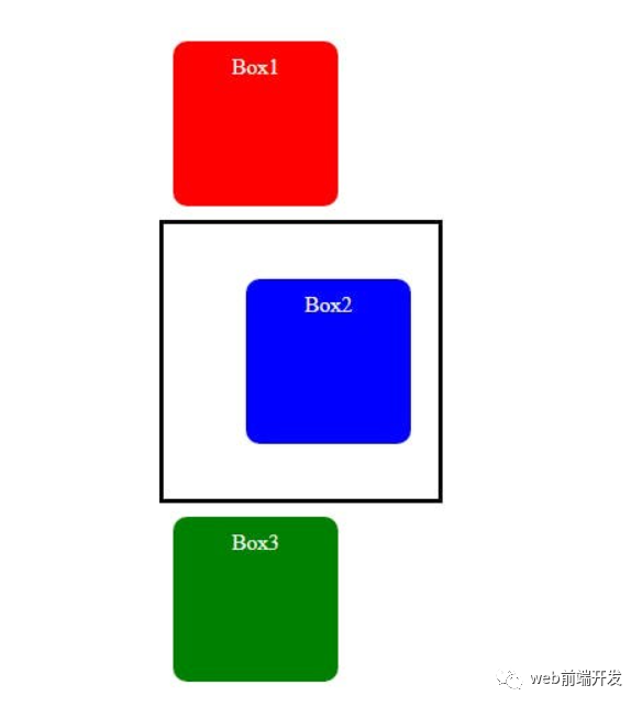
在上面的示例中,第二个盒子位于容器内。容器的位置设置为相对,第二个框的位置设置为绝对,并且该框向下移动 30 像素(使用 top 属性),向右移动 50 像素(使用 left 属性)。容器是第二个盒子的祖先。
如果没有祖先怎么办?
然后该元素将相对于视口定位。
例如:
<!DOCTYPE html><html lang="en"> <head> <meta charset="UTF-8" /> <meta http-equiv="X-UA-Compatible" content="IE=edge" /> <meta name="viewport" content="width=device-width, initial-scale=1.0" /> <link rel="stylesheet" href="style.css" /> <title>CSS position property</title> </head> <body> <div class="box box1">Box1</div> <div class="box box2">Box2</div> <div class="box box3">Box3</div> </body></html>
复制代码
CSS:
.box { height: 100px; width: 100px; border-radius: 10px; margin: 10px; text-align: center; color: white; padding: 10px;}.box1 { background-color: red;}.box2 { background-color: blue; position: absolute; top: 30px; left: 50px;}.box3 { background-color: green;}
复制代码
输出:
4)fixed
使用位置:固定元素相对于视口定位,并且即使页面滚动也保持固定。
语法:
举个例子:
<!DOCTYPE html><html lang="en"> <head> <meta charset="UTF-8" /> <meta http-equiv="X-UA-Compatible" content="IE=edge" /> <meta name="viewport" content="width=device-width, initial-scale=1.0" /> <link rel="stylesheet" href="style.css" /> <title>CSS position property</title> </head> <body> <div class="box box1">Box1</div> <div class="box box2">Box2</div> <div class="box box3">Box3</div> <div class="box"></div> <div class="box"></div> <div class="box"></div> <div class="box"></div> <div class="box"></div> <div class="box"></div> <div class="box"></div> <div class="box"></div> </body></html>
复制代码
CSS:
.box { height: 100px; width: 100px; border-radius: 10px; margin: 10px; text-align: center; color: white; padding: 10px; border: 1px solid black;}.box1 { background-color: red;}.box2 { background-color: blue; position: fixed; top: 50px; left: 50px;}.box3 { background-color: green;}
复制代码
输出:
在上面的示例中,即使向下滚动页面,第二个框的位置也将是固定的。
有了这个属性,就不像 position:relative; 元素原本处于静态位置的位置将不再有空间。
5)sticky
使用 position: sticky;元素根据用户的滚动位置进行定位。它的行为类似于相对元素,直到用户滚动到某个位置,之后它相对于其包含元素或视口变得固定。
语法:
举例:
<!DOCTYPE html><html lang="en"> <head> <meta charset="UTF-8" /> <meta http-equiv="X-UA-Compatible" content="IE=edge" /> <meta name="viewport" content="width=device-width, initial-scale=1.0" /> <link rel="stylesheet" href="style.css" /> <title>CSS position property</title> </head> <body> <div class="box box1">Box1</div> <div class="box box2">Box2</div> <div class="box box3">Box3</div> <div class="box"></div> <div class="box"></div> <div class="box"></div> <div class="box"></div> <div class="box"></div> <div class="box"></div> <div class="box"></div> <div class="box"></div> </body></html>
复制代码
CSS:
.box { height: 100px; width: 100px; border-radius: 10px; margin: 10px; text-align: center; color: white; padding: 10px; border: 1px solid black;}.box1 { background-color: red;}.box2 { background-color: blue; position: sticky; top: 50px; left: 50px;}.box3 { background-color: green;}
复制代码
在上面的示例中,第二个框将表现得像一个相对元素,直到它到达位置 top: 50px; 滚动时,它将表现得像一个固定元素。
CSS 中的 position 属性确定元素相对于其包含元素或视口的位置。
位置属性有以下可能值:
static:这是所有 HTML 元素的默认定位。元素按照文档的正常流程定位并遵循 HTML 结构。
relative:具有 position:relative 的元素遵循其正常的文档流,但可以从其原始位置移动。
绝对:使用位置:绝对的元素不遵循文档的正常流程。该元素相对于其最近定位的祖先进行定位。如果没有祖先,则该元素将相对于视口定位。
固定:具有位置:固定的元素相对于视口定位,并且即使页面滚动也保持固定。
Sticky:具有 position:sticky 的元素根据用户的滚动位置进行定位。
通过充分掌握位置属性,我们可以在网页中获得所需的布局和交互。
总结
到这里,今天这篇文章想要与您分享的内容就结束了,希望对您有所帮助。


评论