如何实现两栏布局
实现两栏布局一般指的是左边固定,右边自适应,这里给出几个案例给大家参考
1、直接使用 calc 计算 right 宽度
.left { width: 200px; background: red; height: 100px; float: left;}.right { width: calc(100% - 200px); background: black; float: left; height: 100px;}
复制代码
2、利用浮动
将左边元素宽度设置为 200px,并且设置向左浮动。将右边元素的 margin-left 设置为 200px,宽度设置为 auto(默认为 auto,撑满整个父元素)
.left { width: 200px; background: red; height: 100px; float: left;}.right { background: black; margin-left: 200px; width: auto; height: 100px;}
复制代码
3、利用 bfc 特性
将 right 设置成(overflow: hidden)触发 bfc(不会与浮动元素重叠)
.left { width: 200px; background: red; height: 100px; float: left;}.right { background: black; overflow: hidden; height: 100px;}
复制代码
4、flex 布局
将 right 的 flex 设置为 1,实现自动撑满父容器
.outer { display: flex;}.left { width: 200px; background: red; height: 100px;}.right { background: black; flex: 1; height: 100px;}
复制代码
5、定位实现
.outer { position: relative;}.left { width: 200px; background: red; height: 100px; position: absolute; left: 0; top: 0;}.right { background: black; height: 100px; position: absolute; left: 200px; top: 0; right: 0;}
复制代码
如何实现三栏布局
一般是指两边固定宽度,中间自适应的布局
1.浮动实现
注意这里必须将中间的盒子 center 放到最后,因为如果放在第二位它会独占一行,下一个浮动元素将会换行
<div class="outer"> <div class="left"></div> <div class="right"></div> <div class="center"></div></div>
复制代码
.left { float: left; width: 100px; height: 100px; background: red;}.right { float: right; width: 200px; height: 100px; background: pink;}.center { height: 100px; margin-left: 100px; margin-right: 200px; background: orange;}
复制代码
2.calc 实现
与第一种类似,只不过动态计算了 center 宽度
.left { float: left; width: 100px; height: 100px; background: red;}.right { float: right; width: 200px; height: 100px; background: pink;}.center { height: 100px; width: calc(100% - 300px); margin-left: 100px; background: orange;}
复制代码
3.圣杯布局
给父容器设置左右 padding 留出空间,然后再给 left 和 right 设置负 margin 让其移上来
.outer { padding: 0 200px 0 100px;}.left { width: 100px; height: 100px; float: left; margin-left: -100px; background: red;}.center { height: 100px; float: left; background: orange; width: 100%;}.right { width: 200px; height: 100px; float: right; background: pink; margin-right: -200px;}
复制代码
4.双飞翼布局
双飞翼布局和圣杯布局的不同之处是通过给 center 套个盒子,通过它的 margin 来留出空间,注意,它要放在最前面
.left {  width: 100px;  height: 100px;  float: left;  margin-left: calc(-100% + 200px);
  background: red;}.center_wrap {  margin: 0 200px 0 100px;}.center {  height: 100px;  float: left;  background: orange;  width: 100%;}.right {  width: 200px;  height: 100px;  float: left;  background: pink;  margin-right: -200px;}
复制代码
<div class="outer"> <div class="center_wrap"> <div class="center"></div> </div> <div class="left"></div> <div class="right"></div></div>
复制代码
5.flex 布局
使用 flex 布局是非常容易实现的,两边设置宽度,中间 flex:1,宽度撑满整个容器
.outer { display: flex;}.left { width: 100px; height: 100px; background: red;}.center { height: 100px; flex: 1; background: orange;}.right { width: 200px; height: 100px; background: pink;}
复制代码
6.定位
.outer { position: relative;}.left { width: 100px; height: 100px; position: absolute; left: 0; top: 0; background: red;}.center { height: 100px; left: 100px; position: absolute; right: 200px; top: 0; background: orange;}.right { width: 200px; height: 100px; background: pink; position: absolute; right: 0; top: 0;}
复制代码
7.grid 布局
使用 grid 则是最简单的,给父元素设置:display:grid,grid-template-colums:左盒子宽度 auto 右盒子宽度,grid-template-rows:高度
.outer { display: grid; grid-template-columns: 100px auto 200px; grid-template-rows: 100px;}.left { background: red;}.center { background: orange;}.right { background: pink;}
复制代码
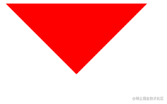
如何利用 css 实现一个三角形
CSS 绘制三角形主要用到的是 border 属性,border 属性是由三角形组成的,如果设置很粗的话就能看出来,比如
div { width: 0; height: 0; border: 100px solid; border-color: red black pink green;}
复制代码
所以可以利用这个特性来绘制三角形,如
div { width: 0; height: 0; border: 100px solid; border-color: red transparent transparent transparent;}
复制代码
如何利用 css 实现一个扇形
很简单,加个 border-radius 即可
div { width: 0; height: 0; border: 100px solid; border-color: red transparent transparent transparent; border-radius: 50%;}
复制代码
画一条 0.5px 的线
正常情况下最小单位是 1px,当然也有现代浏览器也支持 0.5px 的,为了考虑兼容性,有以下几种方案
1.采用 transform: scale()的方式
transform: scale(0.5, 0.5);
复制代码
2.meta viewport
我们经常可以看到 meta viewport 中有initial-scale=1这样一个熟悉,其实它是用来规定页面的初始缩放的,可以设置成 0.5,这样页面的 1px 其实就是 0.5px 了
<meta name="viewport" content="width=device-width, initial-scale=0.5" />
复制代码
css 的实现场景题还有很多,由于篇幅原因先写这些,后续会持续更新哦,敬请期待!
文章转载自:公众号-web前端进阶
原文链接:https://www.cnblogs.com/zdsdididi/p/17477531.html


评论