1 知识背景
1.1 Vue 框架
一个渐进式框架,它易学易用,性能出色,在国内推广最好的三大前端框架中,位居首位!
1.2 OpenTiny 组件库
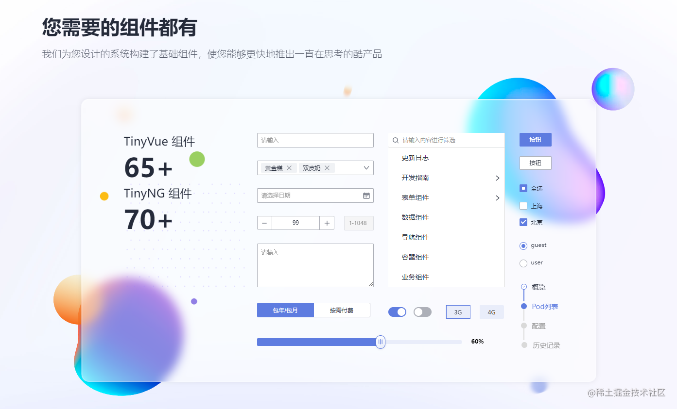
它在华为内部演进了 9 年,支撑了上千个项目的开发交付,它一套 API 同时支持 Vue2 和 Vue3 框架,有 100 多个组件,6 套主题,支持国际化能力,支持 Vite 和 webpack 环境的开发和构建! 它是华为云的 2022 年贡献给开源社区的一个新的 Vue UI 组件库,代码托管在 GitHub: https://github.com/opentiny/tiny-vue, 欢迎大家来 Star 和提 Issue! 安装包发布在 Npm 公共仓库,以及华为内部中心仓,遵从 MIT 开源协议,大家可以自由安装使用! Opentiny 组件库官网文档:https://opentiny.design/tiny-vue
图 1 opentiny 介绍
1.3 组件库的 playgroud
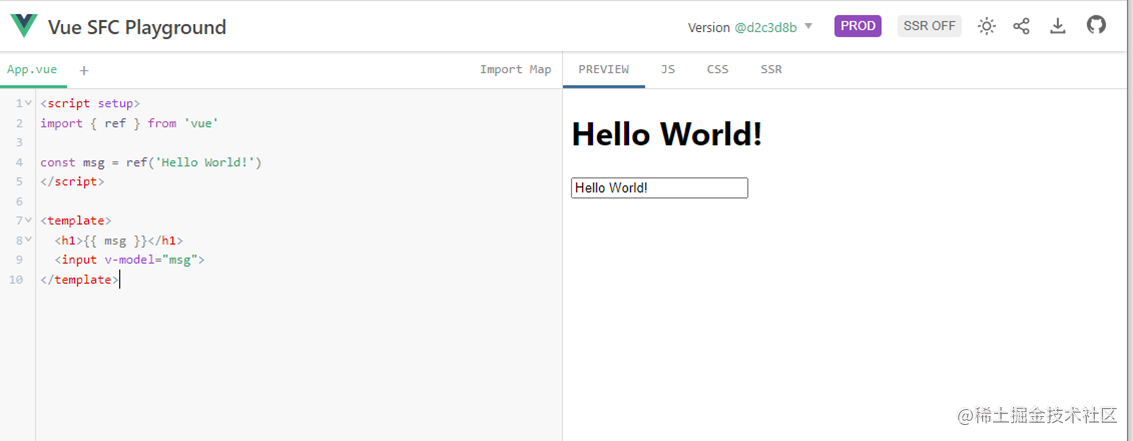
Playground 应用其实是一个实时的组件预览页面,比如 Vue 官网就提供了“Vue 演练场”的功能,链接:https://play.vuejs.org/ ,它方便的提供了一个最小的 Vue 环境,能让用户尝试写一些 Vue 的代码,并查看实时预览结果!
图 2 Vue 官方 playground 效果图
它支持多文件,支持 Import Map 引入第三方组件脚本,支持实时编辑代码,实时编译、预览以及代码分享!组件库的 Playground 就是要搭建一个应用页面,可以实时预览某个组件库的组件,可以通过它快速了解和尝试每一个组件!
Vue 官方开源的 Playground 的组件---@vue/repl,参考文档:https://github.com/vuejs/repl#readme 。
2 如何搭建 OpenTiny 组件库的 playground 的指导
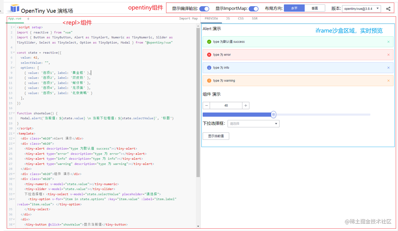
今天的内容就是:搭建一个 OpenTiny 组件库的演练场。本次任务需要你熟悉前端,有 Vue 项目开发的经历才行。完成效果图如下:
图 3 挑战任务示意图
请参考以下步骤来完成此次任务:
2.1 建立新项目,并安装依赖包
安装 nodejs 16+ , vscode 等前端工具,然后使用 vite 来创建一个 vue 的 javascript 工程!
shellnpm create vite@latest
复制代码
之后安装 Playground 的组件和 opentiny/vue 组件的依赖包
shellnpm install @vue/repl @opentiny/vue@3
复制代码
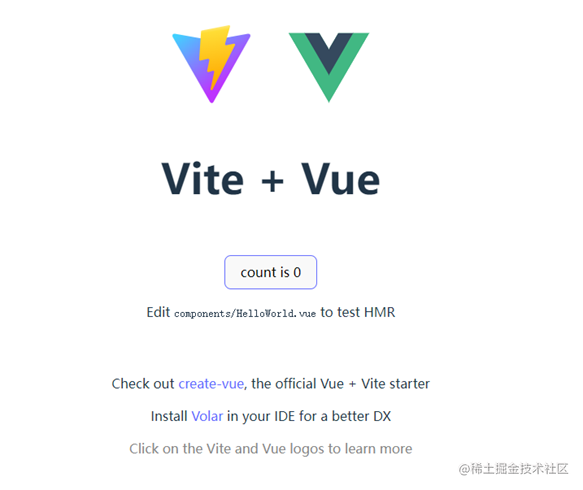
并务必参考 opentiny/vue 的安装文档, https://opentiny.design/tiny-vue/zh-CN/os-theme/docs/installation 进行配置项目。 目前大家已经有一个标准的 vue 项目了,经过 npm intall, 之后,就可以 npm run dev,启动并看到一个 vue 的示例工程。
图四 vue 的新工程初始页面
2.2 创建页面结构,引入所需要的变量
接下来删除掉 HelloWorld.vue ,在 main.js 中, 移除 style.css 引用,我们只在 App.vue 中完成全部功能!App.vue 的页面结构如下:
html<script setup>import { reactive } from 'vue';import { Repl, ReplStore, File } from '@vue/repl'import CodeMirror from '@vue/repl/codemirror-editor'import '@vue/repl/dist/style.css'
import { Switch as TinySwitch, ButtonGroup as TinyButtonGroup, Select as TinySelect, Option as TinyOption, Modal } from '@opentiny/vue'import { IconShare as TinyIconShare } from "@opentiny/vue-icon"
// 将在此处补充逻辑代码
</script>
<template>
<div>将在此处补充模板代码</div> </template>
<style> * {  box-sizing: border-box;}.header {  height: 36px;  display: flex;  flex-direction: row;  justify-content: space-between;  padding-bottom: 6px;  border-bottom: solid 1px #e1e1e1;}.vue-repl {  height: calc(100vh - 36px - 16px) !important;}.header > div {  vertical-align: middle;}.title {  font-size: 20px;}.ml20 {  margin-left: 20px;}</style>
复制代码
2.3 开发顶部功能
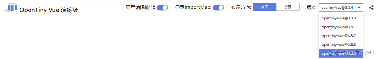
应用的模板分为上下 2 部分,上面部分为标题 Logo 和一组选择功能以及分享按钮!下面部分就是一个<Repl> 组件。我们先开发顶部功能,它的<template>代码如下:
html<div class="header"> <div class="title"> <img src="./assets/opentiny-logo.svg" /> <span>OpenTiny Vue 演练场</span> </div> <div> <span class="ml20"> 显示编译输出: <tiny-switch v-model="state.showCompileOutput" /> </span> <span class="ml20"> 显示ImportMap: <tiny-switch v-model="state.showImportMap" /> </span> <span class="ml20"> 布局方向: <tiny-button-group :data="state.layoutOptions" v-model="state.layout"></tiny-button-group> </span> <span class="ml20"> 版本: <tiny-select v-model="state.selectVersion" style="width:150px"> <tiny-option v-for="item in state.versions" :key="item.value" :label="'opentiny/vue@' + item.value" :value="item.value"> </tiny-option> </tiny-select> </span> <icon-share style="font-size: 16px;margin:0 20px; cursor: pointer;" /> </div> </div>
复制代码
模板里已经绑定了一组数据和方法,接下来,我们需要补充这些内容到<script>部分。
tsconst iconShare = TinyIconShare()
const state = reactive({  // repl 属性  showCompileOutput: true,  showImportMap: true,  layout: 'horizon',  layoutOptions: [{ value: 'horizon', text: "水平" }, { value: 'vertical', text: "垂直" }],  // 版本切换  versions: [{ value: "3.8.0" }, { value: "3.8.1" }, { value: "3.8.2" }, { value: "3.8.3" }, { value: "3.8.4" }],  selectVersion: "3.8.4"})
复制代码
至此,我们应该能得到以下应用,顶部的显示开关和布局方向绑定了 3 个变量,但是版本选择和分享的功能还没有开发!
图五 顶部功能效果图
★ 经过本步骤,我们学会了 @opentiny/vue 的组件的简单使用方法!
2.4 开发<Repl>组件,实现脚本预览
首先在模板中,引入 Repl 标签,并且绑定前面的 3 个变量以及 ReplStore 变量。在 header 结构下面加入下面标签:
html <Repl :store="store" :editor="CodeMirror" :show-compile-output="state.showCompileOutput" :show-import-map="state.showImportMap" :previewOptions="state.previewOptions" :clear-console="false" :layout="state.layout"></Repl>
复制代码
这里用到 store 变量和 state.previewOptions, 所以在<script>部分,增加这些 2 处变量:
ts// repl组件需要store管理状态const store = new ReplStore({  showOutput: true,  outputMode: "preview"});
const state = reactive({  // 加入这一句    previewOptions: { headHTML: '' },})
复制代码
此时我们就得到一个可以联动的 playground 的原型了:在右边编写代码,在左边有实时预览,操作顶部的功能,区域有响应,界面如下:
图六 组件效果图
★ 经过本步骤,我们学会了的组件使用方法!
2.5 实现切换版本
切换版本就是要切换 repl 组件引用的 importMap 的脚本,以实现动态切换@opentiny/vue的版本。 目前它发布了 3.8.0~3.8.4 等 5 个版本!在<script>中,加以下脚本 :
tsconst createImportMap = (version) => {  return {    imports: {      "@opentiny/vue": `https://unpkg.com/@opentiny/vue@${version}/runtime/tiny-vue.mjs`,      "@opentiny/vue-icon": `https://unpkg.com/@opentiny/vue@${version}/runtime/tiny-vue-icon.mjs`,      "@opentiny/vue-locale": `https://unpkg.com/@opentiny/vue@${version}/runtime/tiny-vue-locale.mjs`,      "@opentiny/vue-common": `https://unpkg.com/@opentiny/vue@${version}/runtime/tiny-vue-common.mjs`    }  }};
function versionChange(version) {  const importMap = createImportMap(version)  store.setImportMap(importMap);  state.previewOptions.headHTML = `<link rel="stylesheet" href="https://unpkg.com/@opentiny/vue-theme@${version}/index.css">`}
复制代码
我们编写了 versionChange 函数,把它绑定到前面模板的的 change 事件上,这样下拉变化后,会通知 store 设置新的 importMap 地址! 现在切换版本后,通过开发者工具能看到,它会立即请求相应版本的 @opentiny/vue 的各个 runtime 脚本包。
★ 经过本步骤,我们学会了 Tiny-Select 的组件的事件绑定以及设置 store 的 importMap 变量!
2.6 实现代码分享
Repl 组件是支持代码分享的,它的原理是:store 对象把内部状态序列化为 base64 编码,把它拼在 url 的 hash 中分享给其它人。 当页面加载时,发现 hash 有内容,就知道这是 store 的状态,把它传给 store,store 内部会进行反序列化。 我们应用分享的时候,要记录组件库版本号和 store 状态,所以我们计划用 hash 同时保存版本和 base64 的值: 3.8.4|eNqIVV9p.............
tsconst hash = location.hash.slice(1)// shareData数组如果有2项,则表明是分享链接,否则是非分享页面const shareData = hash.split('|')
const store = new ReplStore({  // 添加下面一行  serializedState: shareData.length == 2 ? shareData[1] : '',  showOutput: true,  outputMode: "preview"});
const state = reactive({  // 修改下面这一行  selectVersion: shareData.length == 2 ? shareData[0] : "3.8.4"})
// 分享链接和非分享链接的逻辑不同,此处判断一下if (shareData.length == 2) {  versionChange(shareData[0])} else {  versionChange('3.8.4')}
// 生成分享链接function share() {  const hash = store.serialize().slice(1)  const shareUrl = location.origin + '#' + state.selectVersion + '|' + hash
  navigator.clipboard.writeText(shareUrl);  Modal.alert(`已复制分享链接`, '分享成功')}
复制代码
把 share 函数绑定给模板中的分享图标的 click 事件,这样点击图标,就能把链接复制到剪切板中了, 再打开一个新页签,访问分享链接。 在分享链接中打开的新页面,当前 hash 就有一个很长的字符串了,这样 shareData 就解析到版本和 store 序列化的后值,所以把 shareData[1]的内容赋值给 store, 这样就实现了分享功能,试一下能不能成功吧!
★ 经过本步骤,我们学会了分享功能的设计以及 store 的序列化!
2.7 测试 @opentiny/vue 组件库
下面是一个 @opentiny/vue 组件库的使用示例,复制到应用窗口,并修改脚本,验证功能是否正确。点击分享按钮,并复制到其它页签,看是否分享内容了。
html<script setup>import { reactive } from "vue"import { Button as TinyButton, Alert as TinyAlert, Numeric as TinyNumeric, Slider as TinySlider, Select as TinySelect, Option as TinyOption, Modal } from "@opentiny/vue"
const state = reactive({  value: 42,  selectValue: "",  options: [    { value: '选项1', label: '黄金糕' },    { value: '选项2', label: '双皮奶' },    { value: '选项3', label: '蚵仔煎' },    { value: '选项4', label: '龙须面' },    { value: '选项5', label: '北京烤鸭' }  ],})
function showValue() {  Modal.alert(`当前值: ${state.value} \n 当前下拉框值: ${state.selectValue}`, '标题')}</script><template>  <div class="mb20">Alert 演示</div>  <div class="mb20">    <tiny-alert description="type 为默认值 success"></tiny-alert>    <tiny-alert type="error" description="type 为 error"></tiny-alert>    <tiny-alert type="info" description="type 为 info"></tiny-alert>    <tiny-alert type="warning" description="type 为 warning"></tiny-alert>  </div>  <div class="mb20">组件 演示</div>  <div class="mb20">    <tiny-numeric v-model="state.value"></tiny-numeric>    <tiny-slider v-model="state.value"></tiny-slider>    下拉选择框:<tiny-select v-model="state.selectValue" placeholder="请选择">      <tiny-option v-for="item in state.options" :key="item.value" :label="item.label" :value="item.value"> </tiny-option>    </tiny-select>  </div>  <div>    <tiny-button @click="showValue">显示当前值</tiny-button>  </div></template>
<style>div .tiny-select {  width: 200px;}
.mb20 {  margin-bottom: 20px;}</style>
复制代码
关于 OpenTiny
OpenTiny 是一套华为云出品的企业级组件库解决方案,适配 PC 端 / 移动端等多端,涵盖 Vue2 / Vue3 / Angular 多技术栈,拥有主题配置系统 / 中后台模板 / CLI 命令行等效率提升工具,可帮助开发者高效开发 Web 应用。
核心亮点:
跨端跨框架:使用 Renderless 无渲染组件设计架构,实现了一套代码同时支持 Vue2 / Vue3,PC / Mobile 端,并支持函数级别的逻辑定制和全模板替换,灵活性好、二次开发能力强。
组件丰富:PC 端有 80+组件,移动端有 30+组件,包含高频组件 Table、Tree、Select 等,内置虚拟滚动,保证大数据场景下的流畅体验,除了业界常见组件之外,我们还提供了一些独有的特色组件,如:Split 面板分割器、IpAddress IP 地址输入框、Calendar 日历、Crop 图片裁切等
配置式组件:组件支持模板式和配置式两种使用方式,适合低代码平台,目前团队已经将 OpenTiny 集成到内部的低代码平台,针对低码平台做了大量优化
周边生态齐全:提供了基于 Angular + TypeScript 的 TinyNG 组件库,提供包含 10+ 实用功能、20+ 典型页面的 TinyPro 中后台模板,提供覆盖前端开发全流程的 TinyCLI 工程化工具,提供强大的在线主题配置平台 TinyTheme
联系我们:


评论