
低代码可视化拖拽编辑器实现方案
- 2023-06-25 福建
本文字数:9536 字
阅读完需:约 31 分钟
一、前言
随着业务不断发展,低代码、无代码平台越来越常见,它降低开发门槛、快速响应业务需求、提升开发效率。零开发经验的业务人员通过可视化拖拽等方式,即可快速搭建各种应用。本文主要是讲解低代码可视化拖拽平台前端展示层面的实现逻辑和方案,对于后端逻辑、数据库设计、以及自动化部署等暂时没有涉及。
https://www.jnpfsoft.com/?infoq
二、展示区划分
首先我们需要先清晰我们要实现的 UI 展示效果,分为三部分(组件选项区、可视化展示区、元素配置编辑区)
1、组件选项区
1.1 数据格式定义
为了展示出各种元素,先定义元素的类型(文字、图片、按钮、banner、表单等等),具体数据格式如下,详情可以查看源码路径(src/config/template.ts、src/config/base.ts),这些组件的每一项也可以存储在库,通过接口查询回来,只是这里没有实现。
template.ts: 定义所有类型自定义组件的配置
export const config: any = { text: [ { config: { name: 'content-box', noDrag: 1, slot: [ { name: 'content-input', style: { backgroundImage: require('@/assets/title1-left-icon.png'), backgroundRepeat: 'no-repeat', backgroundSize: 'contain', borderWidth: 0, fontSize: '14px', height: '13px', lineHeight: '32px', width: '18px' }, value: '' }, { name: 'content-input', style: { height: '32px', paddingLeft: '5px', paddingRight: '5px' }, value: "<div style=\"line-height: 2;\"><span style=\"font-size: 16px; color: #fce7b6;\"><strong>活动规则</strong></span></div>" }, { name: 'content-input', style: { backgroundImage: require('@/assets/title1-right-icon.png'), backgroundRepeat: 'no-repeat', backgroundSize: 'contain', borderWidth: 0, fontSize: '14px', height: '13px', lineHeight: '32px', marginRight: '5px', width: '18px' }, value: '' } ], style: { alignItems: 'center', backgroundColor: 'rgba(26, 96, 175, 1)', display: 'flex', height: '40px', justifyContent: 'center', paddingLeft: '1px' }, value: '' }, name: '带点的标题', preview: require('@/assets/title1.jpg') } ], img: [ { config: { value: require('@/assets/gift.png'), name: 'content-asset', style: { width: '100px', height: '100px', display: 'inline-block' } }, preview: require('@/assets/gift.png'), name: '礼包' } ], btn: [ .... ], form: [ ... ] }base.ts: 中定义基本组件的配置
export const config: any = { text: { value: '<div style="text-align: center; line-height: 1;"><span style="font-size: 14px; color: #333333;">这是一行文字</span></div>', style: {}, name: 'content-input' }, multipleText: { value: '<div style="text-align: center; line-height: 1.5;"><span style="font-size: 14px; color: #333333;">这是多行文字<br />这是多行文字<br />这是多行文字<br /></span></div>', name: 'content-input', style: {} }, img: { value: require('@/assets/logo.png'), name: 'content-asset', style: { width: '100px', height: '100px', display: 'inline-block' } }, box: { name: 'content-box', noDrag: 0, style: { width: '100%', minHeight: '100px', height: 'auto', display: 'inline-block', boxSizing: 'border-box' }, slot: [] } }基本元素(文字 content-input、图片 content-asset)主要包含以下属性: name(组件名称)、style(行内样式)、value(内容值)
盒子元素(content-box)主要包含以下属性: name(组件名称)、style(行内样式)、noDrag(是否可拖拽)、slot(插槽内容)
1.2 实现可拖拽
为了实现可拖拽效果,这里使用了 sortable.js 拖拽库来实现。更多使用细节可查看官方文档。
关键实现代码如下:
// 左侧选项区DOM结构<el-tabs tab-position="left" class="tabs-list" v-model="activeType"> <el-tab-pane v-for="item in props.tabConfig" :key="item.value" :label="item.label" :name="item.value"> <template #label> <span class="tabs-list-item"> <i :class="`iconfont ${item.icon}`"></i> <span>{{item.label}}</span> </span> </template> <div class="tab-content"> <div class="tab-content-title">{{item.label}}</div> <div class="main-box" ref="mainBox"> <div class="config-item base" v-if="activeType === 'base'" data-name="text" @click="addToSubPage(Base.config['text'])"> <el-icon :size="20"><Document /></el-icon> <div>文本</div> </div> <div class="config-item base" v-if="activeType === 'base'" data-name="box" @click="addToSubPage(Base.config['box'])"> <el-icon :size="20"><Box /></el-icon> <div>盒子</div> </div> <div class="config-item" v-for="_item in item.children" :key="_item" :data-name="_item" @click="addToSubPage(Base.config[_item])"> <div v-if="activeType === 'text'" class="config-item-text" v-html="Base.config[_item].value"></div> <img v-if="activeType === 'img'" class="config-item-img" :src="Base.config[_item].value"/> </div> <div class="config-item" v-for="(tItem, tIndex) in Template.config[activeType]" :key="tItem.id" :data-type="activeType" :data-index="tIndex" @click="addToSubPage(tItem.config)"> <img :src="tItem.preview" class="preview"> </div> </div> </div> </el-tab-pane></el-tabs>const mainBox = ref()const initSortableSide = (): void => { // 获取mainBox下每一个元素,遍历并注册拖拽组 Array.from(mainBox.value).forEach(($box, index) => { instance[`_sortable_${index}`] && instance[`_sortable_${index}`].destroy() instance[`_sortable_${index}`] = Sortable.create($box, { filter: '.ignore', // 需要过滤或忽略指定元素 sort: false, // 不允许组内排序 group: { name: 'shared', // 自定义组名 pull: 'clone', // 从当前组克隆拖出 put: false, // 不允许拖入 }, // 开始拖拽回调函数 onStart: () => { // 给subpage展示区添加选中框样式 (document.querySelector('.subpage') as HTMLElement).classList.add('active') }, // 结束拖拽回调函数 onEnd: ({ item, originalEvent }: any) => { ... } }) })}这里主要讲一下 onEnd 里面的逻辑,当拖拽组件并将其移动到中间的可视化展示区的时候,需要做以下 2 个关键操作。
判断是否拖拽到可视化展示区内
获取当前拖拽元素的配置,并更新 pinia 中 store 的值。(pinia 是 vue 新一代状态管理插件,可以认为是 vuex5.)
onEnd: ({ item, originalEvent }: any) => { // 获取鼠标放开后的X、Y坐标 const { pageX, pageY } = originalEvent // 获取可视化展示区的上下左右坐标 const { left, right, top, bottom } = (document.querySelector('.subpage') as HTMLElement).getBoundingClientRect() const { dataset } = item // 为了移除被clone到可视化区的dom结构,通过配置来渲染可视化区的内容 if ((document.querySelector('.subpage') as HTMLElement).contains(item)) { item.remove() } // 编辑判断 if (pageX > left && pageX < right && pageY > top && pageY < bottom) { // 获取自定义属性中的name、type 、index const { name, type, index } = dataset let currConfigItem = {} as any // 若存在type 说明不是基础类型,在template.ts找到对应的配置。 if (type) { currConfigItem = utils.cloneDeep(Template.config[type][index].config) // 使用nanoid 生成唯一id currConfigItem.id = utils.nanoid() // 递归遍历组件内部的slot,为每个元素添加唯一id currConfigItem.slot = configItemAddId(currConfigItem.slot) } else { // 基础类型操作 currConfigItem = utils.cloneDeep(Base.config[name]) currConfigItem.id = utils.nanoid() } // 修改pinia的store数据 templateStore.config.push(currConfigItem) // 触发更新(通过watch实现) key.value = Date.now() } else { console.log('false') } // 移除中间可视化区选中样式 (document.querySelector('.subpage') as HTMLElement).classList.remove('active') }2、可视化展示区
中间的可视化展示区的功能主要是提供用户对具体元素选中以及拖拽操作。因此主要实现元素展示 、选中框以及可拖拽功能。
2.1 元素展示
元素展示比较简单,只需要通过遍历 pinia 的 store 中的页面配置 config,并用动态组件 component 标签展示即可
<component v-for="item in template.config" :key="item.id" :is="item.name" :config="item" :id="item.id"></component>2.2 实现选中框
实现选中框的逻辑相对复杂一点,其中关键的两个事件是 hover(鼠标悬浮在元素上)和 select(鼠标点击元素)。
定义一个响应式对象来存储它们的变化情况:
const catcher: any = reactive( { hover: { id: '', // 元素id rect: {}, // 元素坐标 eleName: '' // 元素类名 }, select: { id: '', rect: {}, eleName: '' } })定义事件监听器(mouseover、click)
import { onMounted, ref } from 'vue'const subpage = ref()
const listeners = {  mouseover: (e: any) => {    // findUpwardElement方法为向上查找最近的目标元素    const $el = utils.findUpwardElement(e.target, editorElements, 'classList')    if ($el) {      catcher.hover.id = $el.id      // 重置catcher响应式对象      resetRect($el, 'hover')    } else {      catcher.hover.rect.width = 0      catcher.hover.id = ''    }  },  click: (e: any) => {    const $el = utils.findUpwardElement(e.target, editorElements, 'classList')    if ($el) {      template.activeElemId = $el.id      catcher.select.id = $el.id      resetRect($el, 'select')    } else if (!utils.findUpwardElement(e.target, ['mouse-catcher'], 'classList')) {      removeSelect()    }  }} as any
onMounted(() => { Object.keys(listeners).forEach(event => { subpage.value.addEventListener(event, listeners[event], true) })})定义修改 catcher 响应式对象方法
interface rectInter {  width: number;  height: number;  top: number;  left: number;}
// 修改catcher对象方法const resetRect = ($el: HTMLElement, type: string): void => {  if ($el) {    const parentRect = utils.pick(subpage.value.getBoundingClientRect(), 'left', 'top')    const rect: rectInter = utils.pick($el.getBoundingClientRect(), 'width', 'height', 'left', 'top')    rect.left -= parentRect.left    rect.top -= parentRect.top    catcher[type].rect = rect    catcher[type].eleName = $el.className  }}
const removeSelect = (): void => {  catcher.select.rect.width = 0  catcher.select.id = ''  catcher.hover.rect.width = 0  catcher.hover.id = ''  template.activeElemId = ''}
// 重置select配置const resetSelectRect = (id: string): void => { if (id) { resetRect(document.getElementById(id) as HTMLElement, 'select') } else { removeSelect() }}选中框组件
选中框组件包括选中框主体(通过不同颜色区分盒子还是元素)、功能栏(上下移动、删除、复制)。
// 将catcher对象传入组件<MouseCatcher class="ignore" v-model="catcher"></MouseCatcher>比较关键的点是在操作功能栏的时候对全局配置的修改,详细逻辑可以查看源码(src/components/mouse-catcher/index.vue)
2.3 实现可视区拖拽
接下来是实现可视化展示区的可拖拽,这个区域与选项区不同,它允许内部元素的排序以及拖到别的拖拽组(盒子)。
关键逻辑如下:(主要分析 onEnd 回调中的逻辑)
const initSortableSubpage = (): void => { instance._sortableSubpage && instance._sortableSubpage.destroy() instance._sortableSubpage = Sortable.create(document.querySelector('.subpage'), { group: 'shared', filter: '.ignore', onStart: ({ item }: any) => { console.log(item.id) }, onEnd: (obj: any) => { let { newIndex, oldIndex, originalEvent, item, to } = obj // 在可视区盒子内拖拽 if (to.classList.contains('subpage')) { const { pageX } = originalEvent const { left, right } = (document.querySelector('.subpage') as HTMLElement).getBoundingClientRect() // 判断是否移出可视区 if (pageX < left || pageX > right) { // 移出可视区,则移除元素 templateStore.config.splice(oldIndex, 1) } else { // 判断移动位置发生更改 if (newIndex !== oldIndex) { // 新的位置在最后一位,需要减1 if (newIndex === templateStore.config.length) { newIndex = newIndex - 1 } // 旧的位置在最后一位,需要减1 if (oldIndex === templateStore.config.length) { oldIndex = oldIndex - 1 } // 数据互换位置 const oldVal = utils.cloneDeep(templateStore.config[oldIndex]) const newVal = utils.cloneDeep(templateStore.config[newIndex]) utils.fill(templateStore.config, oldVal, newIndex, newIndex + 1) utils.fill(templateStore.config, newVal, oldIndex, oldIndex + 1) } } } else { // 若将元素移动至其他拖拽组(盒子) const itemIndex = templateStore.config.findIndex((x: any) => x.id === item.id) const currContentBox = utils.findConfig(templateStore.config, to.id) const currItem = templateStore.config.splice(itemIndex, 1)[0] currContentBox.slot.push(currItem) } } })}2.4 实现盒子内拖拽
这里需要注意需要筛选可视区盒子 subpage 中类名为 content-box,并且不包含类名为 no-drag 的。
其关键逻辑也是在 onEnd 回调函数里,需要区分元素在当前盒子内部移动、元素移动到其他盒子、元素移动到可视区(subpage)盒子三种情况。

编辑
const initSortableContentBox = () => { console.log(Array.from(document.querySelectorAll('.subpage .content-box')).filter((x: any) => !x.classList.contains('no-drag'))) Array.from(document.querySelectorAll('.subpage .content-box')).filter((x: any) => !x.classList.contains('no-drag')).forEach(($content, contentIndex) => { instance[`_sortableContentBox_${contentIndex}`] && instance[`_sortableContentBox_${contentIndex}`].destroy() instance[`_sortableContentBox_${contentIndex}`] = Sortable.create($content, { group: 'shared', onStart: ({ from }: any) => { console.log(from.id) }, onEnd: (obj: any) => { let { newIndex, oldIndex, item, to, from } = obj if (to.classList.contains('subpage')) { // 元素移动至可视区盒子 const currContentBox = utils.findConfig(templateStore.config, from.id) const currItemIndex = currContentBox.slot.findIndex((x: any) => x.id === item.id) const currItem = currContentBox.slot.splice(currItemIndex, 1)[0] templateStore.config.push(currItem) } else { if (from.id === to.id) { // 同一盒子中移动 const currContentBox = utils.findConfig(templateStore.config, from.id) if (newIndex !== oldIndex) { if (newIndex === currContentBox.length) { newIndex = newIndex - 1 } if (oldIndex === currContentBox.length) { oldIndex = oldIndex - 1 } const oldVal = utils.cloneDeep(currContentBox.slot[oldIndex]) const newVal = utils.cloneDeep(currContentBox.slot[newIndex]) utils.fill(currContentBox.slot, oldVal, newIndex, newIndex + 1) utils.fill(currContentBox.slot, newVal, oldIndex, oldIndex + 1) } } else { // 从一个盒子移动到另一个盒子 const currContentBox = utils.findConfig(templateStore.config, from.id) const currItemIndex = currContentBox.slot.findIndex((x: any) => x.id === item.id) const currItem = currContentBox.slot.splice(currItemIndex, 1)[0] const toContentBox = utils.findConfig(templateStore.config, to.id) toContentBox.slot.push(currItem) } } } }) })}三、元素配置编辑区
该区域是用于编辑修改元素的行内样式,目前简单实现了字体、位置布局、背景、边框、阴影配置。
3.1 字体编辑
字体编辑功能使用富文本编辑器 tinymce,这里使用 vue3-tinymce,它是基于 vue@3.x + tinymce@5.8.x 封装的富文本编辑器。
更多配置可参考官方文档, 下面的对 vue3-tinymce 进行封装。
<template>  <vue3-tinymce v-model="state.content" :setting="state.setting" /></template>
<script lang="ts" setup>import { reactive, watch } from 'vue';// 引入组件import Vue3Tinymce from '@jsdawn/vue3-tinymce'import { useTemplateStore } from '@/stores/template'import { findConfig } from '@/utils'
const template = useTemplateStore()const props = defineProps({  modelValue: {    type: String,    default: ''  }})
const state = reactive({  content: '',  setting: {    height: 300,    language: 'zh-Hans',    language_url: '/tinymce/langs/zh-Hans.js'  }})
watch(() => props.modelValue, () => {  props.modelValue && (state.content = findConfig(template.config, props.modelValue)?.value)})
watch(() => state.content, () => { const config = findConfig(template.config, props.modelValue) config && (config.value = state.content)})</script>3.2 位置布局
可修改元素的内外边距、宽高、布局类型(display)、定位类型(position)。
3.3 背景
可修改元素背景颜色、圆角、渐变方式。
3.4 边框
可修改边框类型,包括无边框、实线、虚线、点线
3.5 阴影
可修改阴影颜色、以及阴影的 X、Y、距离、大小。
基础组件
文字组件
<script lang="ts">export default {  name: "ContentInput"};</script>
<script setup lang='ts'>import { PropType } from 'vue';import { useStyleFix } from '@/utils/hooks'
const props = defineProps({  config: {    type: Object as PropType<any>  }})</script>
<template>  <div     class="content-input"    v-html="props.config.value"    :style="[props.config.style, useStyleFix(props.config.style)]"  >  </div></template>
<style lang='scss' scoped>.content-input { word-break: break-all; user-select: none;}</style>图片组件
<script lang="ts">export default {  name: "ContentAsset"};</script>
<script setup lang='ts'>import { PropType } from 'vue'
const props = defineProps({  config: {    type: Object as PropType<any>  }})</script><template>  <div class="content-asset" :style="props.config.style">    <img :src="props.config.value">  </div></template>
<style lang='scss' scoped>img { width: 100%; height: 100%;}</style>盒子组件
<script lang="ts">export default {  name: "ContentBox"}</script>
<script setup lang='ts'>import { PropType } from 'vue'const props = defineProps({    config: {    type: Object as PropType<any>  }})</script><template>  <div :class="['content-box', { 'no-drag': props.config.noDrag }]" :style="props.config.style">    <component v-for="item in props.config.slot" :key="item.id" :is="item.name" :config="item" :id="item.id"></component>  </div></template>
<style lang='scss' scoped></style>到这里基本的实现流程都完毕,目前的版本还比较简单,还有很多可以实现的功能,比如撤回、重做、自定义组件选项、接入数据库等。
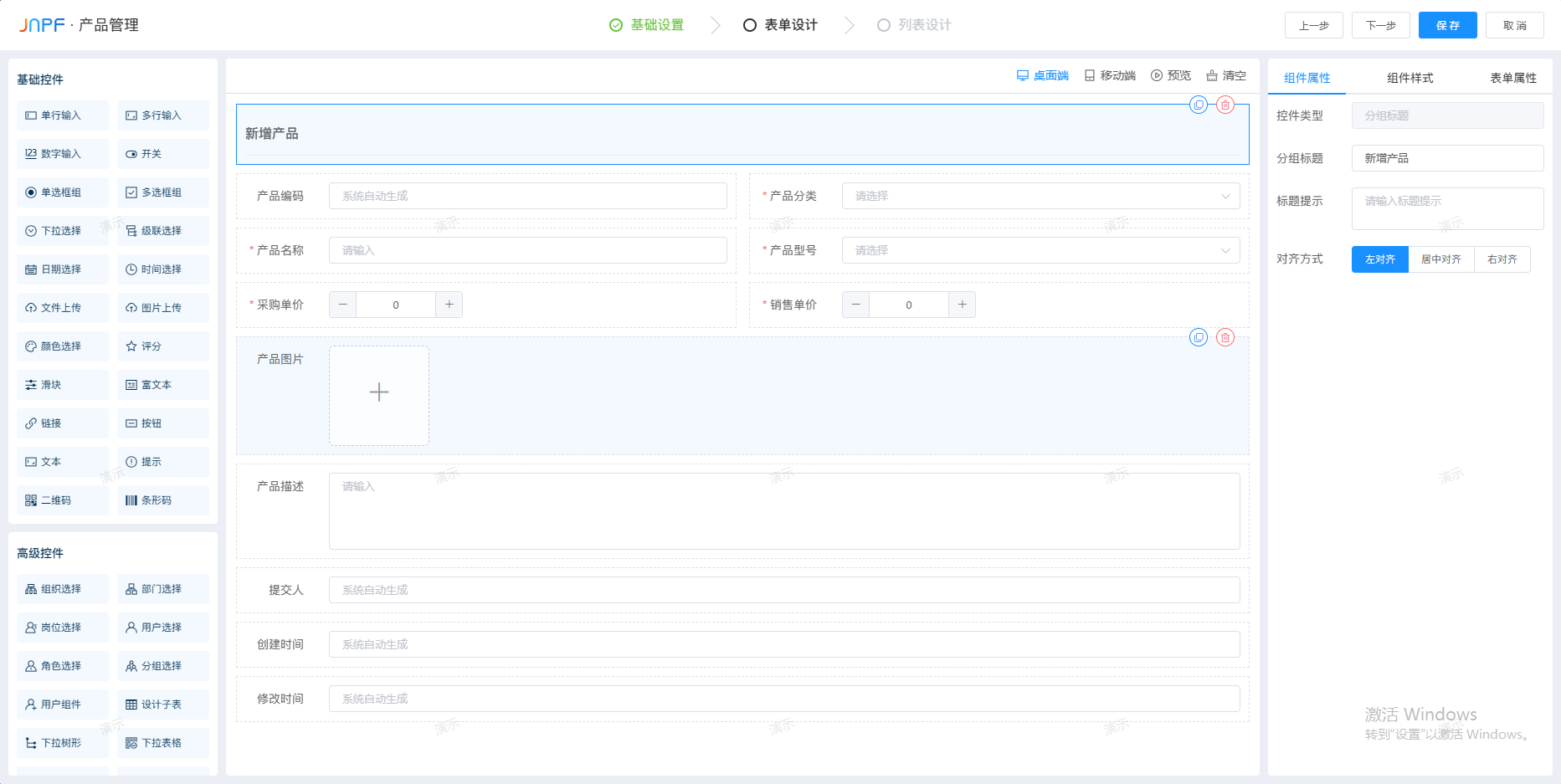
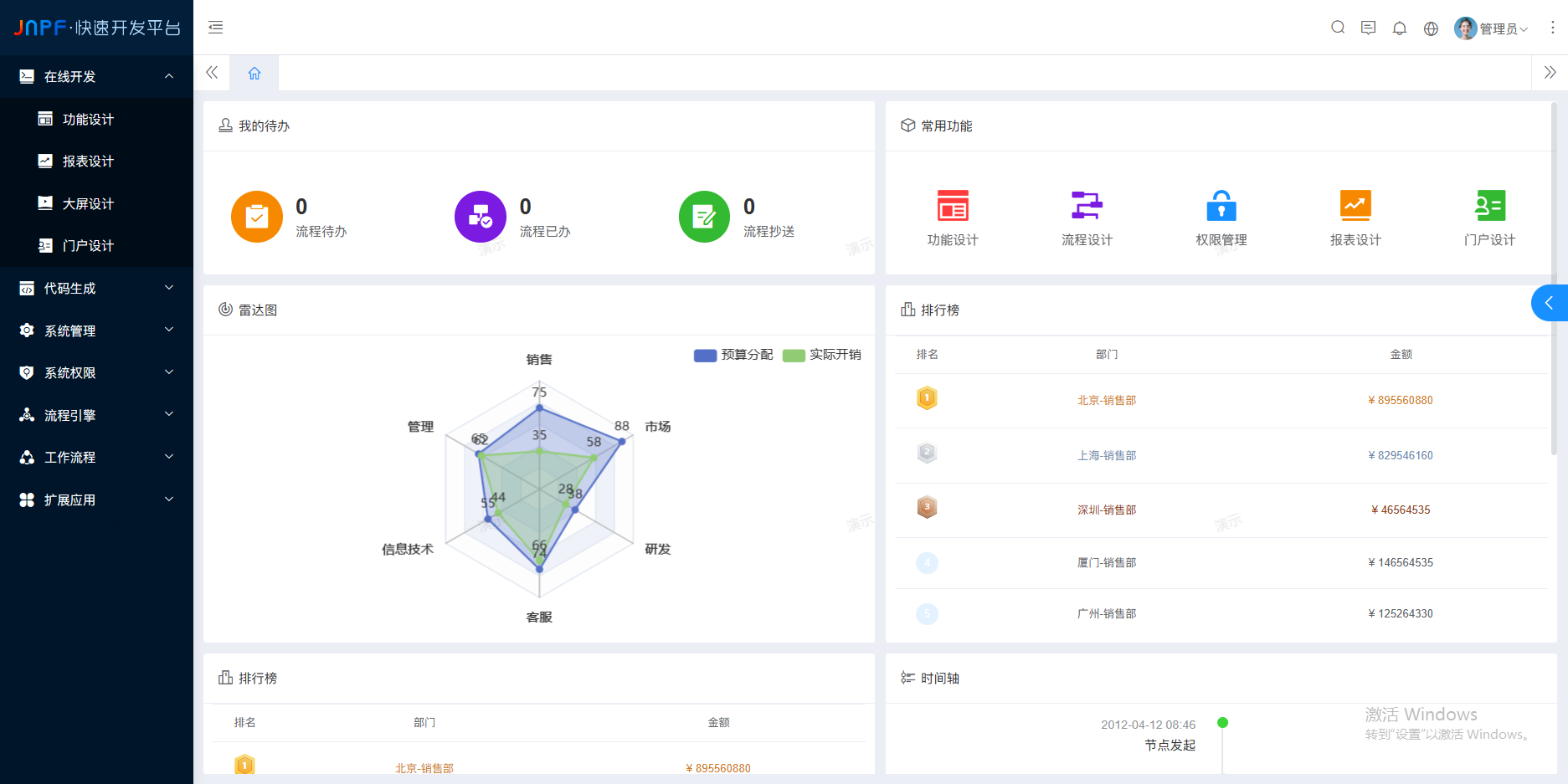
最后,推荐一款前段时间用的不错的低代码JNPF快速开发平台(https://www.jnpfsoft.com/?infoq)采用 SpringBoot 微服务架构、支持 SpringCloud 模式,完善了平台的扩增基础,满足系统快速开发、灵活拓展、无缝集成和高性能应用等综合能力;采用前后端分离模式,前端和后端的开发人员可分工合作负责不同板块,省事便捷。你可以试试看。
版权声明: 本文为 InfoQ 作者【这我可不懂】的原创文章。
原文链接:【http://xie.infoq.cn/article/0a6251ec6cfceec076b21165c】。
本文遵守【CC-BY 4.0】协议,转载请保留原文出处及本版权声明。

这我可不懂
低代码技术追随者,为全民开发而努力 2023-02-15 加入
大家好,我是老王,专注于分享低代码图文知识,感兴趣的伙伴就请关注我吧!


评论